The Ultimate Guide to Good Digital Signage Content

Awful content can make beautiful displays look terrible.
Awesome content can make even old displays look great.
This is what motivated us to create this post – To help combat the bad and make way for the new, improved digital signage content, with our simple yet powerful tips.
By following this guide you will acquire the fundamentals of creating good Digital Signage content.
We cover everything you need to know including layout composition, fonts, imagery, contrast, colour, animation and more.
Let’s begin.
Composition

Use a visual hierarchy of priority, with the most important message being the largest, and usually from top to bottom. This being said, keep all items of reasonable size to ensure users can read the content at the required distance.
Keep it short and concise so that users can read the main information at a glance.
Do not over clutter the display with too much information.
There are a few popular compositions that help to create easy to read and dynamic layouts.
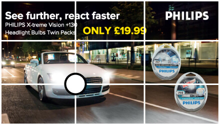
The Rule of Thirds, mainly used in photography and film making, divides the composition into 9 equal parts. This creates a grid system in which the most ‘eye-catching’ element can be placed where the lines interconnect. Creating an alluring perspective apposed to the content being centred. You’ll be surprised how effective this can be.
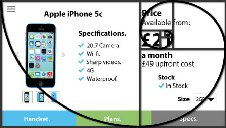
The Golden Ratio, discovered by the ancient greeks is still a popular layout tool today. This composition, involved heavily with mathematical proportions, is found all across nature and is deemed to be ‘pleasing’ to the human eye. Layouts and designs can be built around this with the focal point being the centre of the spiral. For those interested, the golden ratio is found by ‘dividing a line into two parts so that the longer part divided by the smaller part is also equal to the whole length divided by the longer part’.
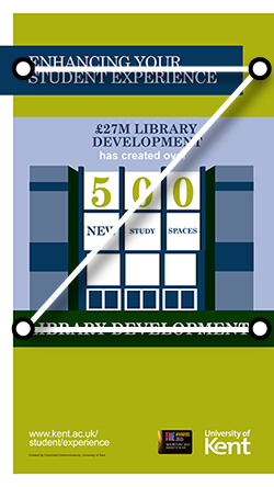
The Z Layout follows the natural pattern your eyes take when scanning a screen. It can help give weight to important elements placed at the ends of the shape.
A common and effective use of this shape consists in this order:
- Logo or Title
- Subheading/Navigation
- Information
- Call to action
Empty or White Space
Don’t feel the need to fill every area with content. Leaving blank spots further emphasises the areas that are filled with content.
Allowing a safe area, especially for touch solutions will not only aid aesthetically but ensure users can reach the touch targets and are not prodding the sides of the screen or other objects.
Fonts
“Typography is the detail and the presentation of a story. It represents the voice of an atmosphere, or historical setting of some kind. It can do a lot of things.”
Cyrus Highsmith, author of Inside Paragraphs.
Each curve and line builds upon the image you are trying to portray. This is why a small change of uploading custom fonts to your signage platform can dramatically change the look and feel of the finished design. Sticking to your brand guidelines helps to reinforce your the company’s image and purpose but don’t be afraid to try something new.
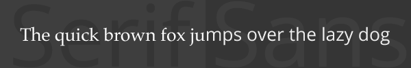
Serif or Sans Serif? That is the question.
There is an awesome inforgraphic by Urban Fonts that covers this battle in detail but, to keep it short, Serif fonts give a more traditional feel and are commonly used in print. Sans fonts are predominately used for web and screen based applications due to the lower DPI of displays, and give a more modern, minimal feel.
The best font choices are the ones which provide the message without any distraction.
Only complementing the overall feel.
You should also take into account the following for maximising legibility:
- Size of the type
- Line spacing and kerning
- Age of the reader
- Distance of the viewer from the screen
- Contrasting font colour
- No more than two fonts
As shown in the example below, it is quite obvious the impact the typography has on the overall aesthetic. The left demonstrates prestige and class whereas the other is nauseating.
Need help finding fonts? Here are some useful font libraries:
- DaFont – Free
- 1001 Fonts – Free
- Fontlibrary – Free
- Google Fonts – Free
- Adobe Typekit If you have a paid Adobe CC account
Imagery
Professional imagery or graphics can play a huge part in representing the brand as it will be the first thing to catch the eye of the consumer or colleague. Images make content 43% more persuasive than content without them, proving images are key for making a positive first impression.
Take care when using photos as backgrounds for text as it can obscure the main message. Try to use colour overlays and opacity for this type of background.
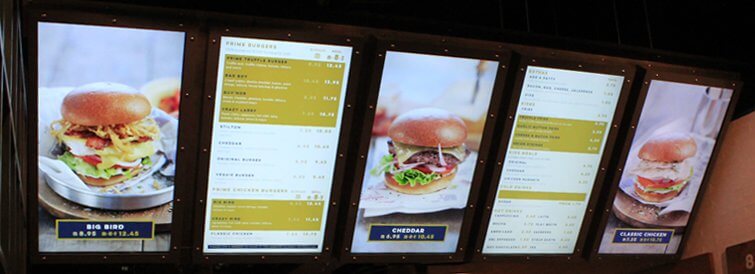
Prime Burger shows exactly how it’s meant to be done with bold, clean, uninterrupted, professional imagery. This, accompanied with east-to-digest (excuse the pun) menu boards creates an inviting and effective display:
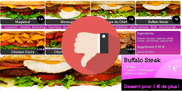
Below is an example of how not to use imagery in your Digital Signage. Multiple unappetizing images crammed together providing no guidance of where to look next.
Textured backgrounds such as blackboard or wooden slabs can bring character to your signage without taking away from the text or message.
Need help finding images? Some useful professional image libraries include:
- Shutterstock
- iStock
- Adobe Stock
- StockSnap is free!
Contrast
Visibility and legibility can be vastly improved with using colours that complement each other and screens with high-contrast ratios. Take care when selecting contrasting colours, so often do we see contrasting colours that are migraine-inducing.

Contrast will also vary depending on the device used for your signage. Commercial grade screens will most likely have a higher contrast ratio and in turn make colours ‘pop’ more than their consumer counterpart.
Colours
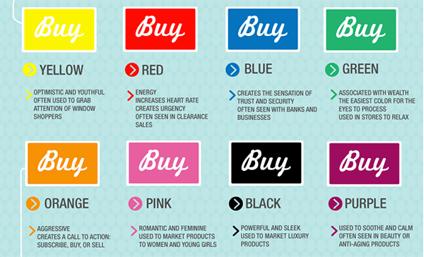
Colours create a big perception on the look and feel of content. Clearly you may be governed by your brand guidelines but below we have taken an excerpt from Kissmetrics’ post about how colour affects purchases. For example, by colouring your call to action as orange, it creates an aggressive, impactive feel.
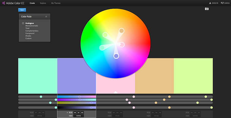
A great tool for finding colours that work together is Adobe Color CC aka Kuler. Browse from thousands of pre-made colour schemes or create your own and import them into the Adobe suite.
Animation
Intel discovered than on average, animated content receives 5 times more viewers than static content. Not only this, the study further found that the engagement was for a much longer period of time.
Animation doesn’t necessarily need to be created by a professional (although this will most likely gain the best results). Even by using playlist item transition animations between content or background videos can make a big difference to content. Be careful thought, as you do not want to let the animation get in the way of the main message you are trying to portray.
This is a great example of good digital signage content using a combination of static and animated content. The content was designed by US-based digital signage provider, Embed Digital which includes a video background with dynamic data text content overlaid:
Need help finding stock videos? Here are a few great places to find stock footage and project files for After Effects:
15 second adverts
For video adverts displayed on digital signage, a DS-IQ study found that shorter adverts of around 15 seconds lifted sales by more than 50% when compared to a 30 second version. Presumably due to the small attention span of humans being at around 8 seconds.

User Interface Design for touch devices
When creating content for touch devices, always keep touch interaction at the forefront of your mind.
Navigation should be kept very simple with constant access to simple functions such as back or home buttons. Breadcrumb trails are also extremely useful as a way to keep track of your progress and give the ability to return to any section at any given time, especially for large interactive content layouts.
Content should be larger with touch, giving fewer options, making it easy to find the next step. Content items should be at least large enough to make sure the contact geometry falls inside the item without pressing neighbouring content.
Make sure touch points are not too close to the edge of the layout so that when a user interacts on the actual touch device the touch points are not on the edge of the screen, making them more difficult to activate (especially on smaller touch devices).
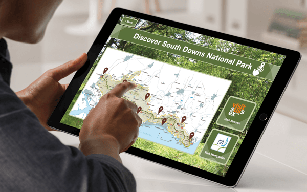
Below is a good example of interactive content. Developed for South Downs National Park, this gives the user a very clear interface with buttons that are large enough to touch without accidentally activating other content. There is also a consistent ‘back’ button for navigation to other areas of the layout.
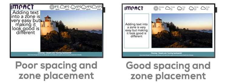
Zone Geometry and Spacing
Sizes of zones within layouts and indeed the spacing of content within those zones can be the difference between an ‘alright’ layout and a ‘good’ layout. Using spacing in design helps to establish contrast, emphasis and hierarchy. It can also generate drama and tension and provide visual rest between groups of elements.
This post by Smashing Magazine covers space used within design in much greater detail but try to consider spacing as an active element of your design and not just and empty area or passive background.
I would like to leave you with a quote that may inspire.
‘Design is not just what it looks and feels like. Design is how it works‘ – Steve Jobs
When creating your Digital Signage content, think about what makes sense, how each element can work and the end goal you are trying to achieve… and if you are still struggling to create good content that works, seriously consider hiring a professional to develop your content.