To Touch or Not To Touch – The Digital Signage Guide
‘To touch, or not to touch, that is the Digital Signage question’ – William Shakespeare*
*Or something along those lines.
Using touch enabled signage and devices can be an extremely powerful tool, creating an immersive and informative experience. This being said, if not deployed correctly can be a frustrating and negative experience for the user. I’m sure we can all recall using a device in which we are frantically prodding the display in order to get some sort of response.
This post will act as a easy-to-digest guide on when and how to use touch with Digital Signage.
Know Your Goal, Know Your User.
First things first, know your objective. Is it to boost sales, get consumers where they need to be or to efficiently display todays menu? Or even a combination of a few. There is a multitude of reasons why to switch to digital, but should you also make the jump to interactive Digital Signage?
Reasons to go interactive:
- Serves a complex purpose – Wayfinding, Product Information Points etc
- Physical engagement with the signage – to strengthen your brand image
- Personalise the customer experience – without BLE Beacons or audience measurement technology
- Display is located in a ‘captive environment’ – your consumers have the time to engage
- Measure engagement – see what is getting users to take action
UI/UX Design Tips
If you’ve been assigned the task of creating your Interactive Digital Signage, there are some important points to remember.
Start by planning user flows and wireframing (the basic structure of each page). It will prove to be priceless when you start to build up a complex layout.
Size Matters
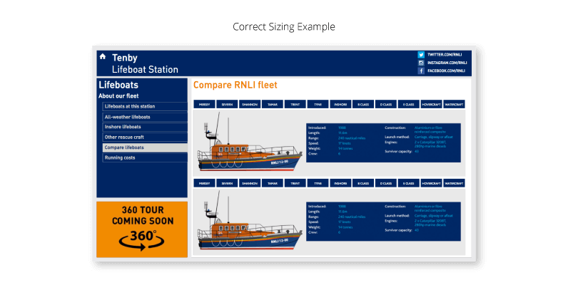
From buttons, to navigation, to fonts; size matters. The size of each object will depend on the hardware size and resolution, so that objects do not get drowned out or are overwhelming.
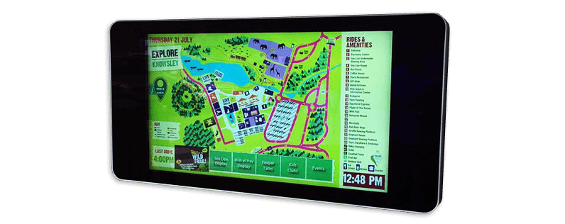
It’s important to remember you can’t take everything in at once for large format displays. Numerous times have I seen users having to take a step back to try and find something that should be obvious. This calls for the need of a large, logical structure and objects when creating for large displays.
Keep in mind the audience your catering the content for. An older demographic may need a more simple interface with larger objects and clear instructions.
Spacing
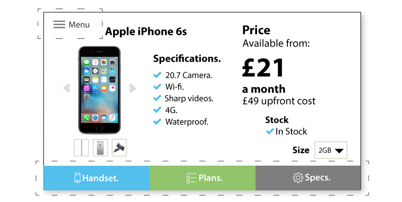
Although it may seem obvious, placing interactive zones such as buttons too close together can cause interaction issues. The average size of a fingertip measures 16-20mm. Always develop your content for larger fingers… and then some. Creating the touch zone larger than the button itself will create less margin for error.
Navigation
Being unique and innovative is a good thing. Not so much when it comes to navigation however. The internet generation had become used to having navigation at the top, bottom or left hand side of the display and the ‘Back’ or ‘Home’ is usually represented in the top left, and should be available at all times. We recommend you stick to this so that first time users can easily get started with your project.
Recently with larger format displays the navigation has migrated to the bottom of the screen so that your hand doesn’t cover the button or other content as you move to press it.
Visual Aid
Visually indicate what each element does with accompanying text. Icons help to make the process faster and smoother as humans process visuals faster than text. They are also universal for users with a different dialect.
Install Environment
Location is hugely important when encouraging people to even just glance at your signage. It will largely depend on the application of your signage, but a few points need to be kept in mind. There are a few standard options on choosing where a device will be placed. Wall mounted, free standing totem / kiosk or hung from the ceiling are the most common choices.
Ouch
Try not to ‘break’ users necks by placing the touch screen at an impractical height. Also bare in mind human arms (or at least mine) are not built to be held out horizontally for long periods of time. This point ties in with the angle of the display, to offer maximum comfort and avoid any parallax issues. There will clearly be exceptions on the matter due to the height difference of the population, but as the average height is approximately 5ft 4in (165cm), be sure to place the display comfortably inline, or below that if the signage is to be used for a significant time. Don’t forget disabled access.
Minority report got it wrong.
https://www.youtube.com/watch?v=PJqbivkm0Ms
Captive or Passing?
Both Captive and Passing environments have their benefits. Captive environments, such as a waiting room or hotel lobby, mean the potential user is likely to have more time to interact, therefore you can customise your content accordingly i.e. layout could potentially be more complex and specifically targeted. Passing environments such as train stations, have the advantage of increased traffic but with less time, therefore both hardware and content need to be made clear, concise and rapidly responsive.
That’s great, but what hardware should I use?
Hardware
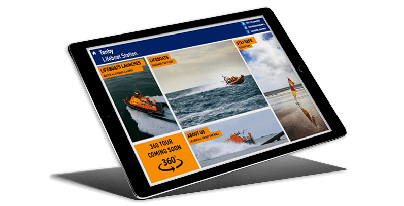
With companies like Apple setting the bar with devices that react instantly upon touch, we expect the same responsiveness everywhere. All too often do we get come across devices that have input lag or a poor user experience. This is why getting the hardware correct is equally important for projecting a professional and forward thinking image. The increasingly short attention span of the average human has caused this.
Here are some reliable products that our certified resellers have used for interactive projects… other brands and products are available.
ELO
ELO have been in the Digital Signage and touch screen market for over 40 years and helped pioneer the touch screen we know today. Their Interactive Digital Signage Touchmonitors range from 32″ all the way to 70″ and offer a high end multi-touch experience. Designed for commercial use with slim, durable chassis, strengthended glass, PCAP or IR 10 point touch and bright 500nit LED panels.
Optional high performance slot-in computer modules can be intergrated for signage projects that need that extra firepower.
iOS
As mentioned before, Apple’s touch devices have brought a new standard to touch. From a 4″ iPod touch to a 12.9″ iPad Pro (although slightly overkill for most signage applications), Apple’s snappy hardware, crisp displays and clean asthetics make a promising choice for touch applications. iOS also has an inbuilt Guided Access mode allowing a chosen application to be locked down and tamper proof to the public.
AllSee
AllSee provide a variety of interactive products, including IP65 rated outdoor touch displays and totems. When combined with a sufficient media player these products make for an ideal commercial grade touch solution.
ONELAN
ONELAN‘s renowned HD media players come in a variety of specifications providing you with the power and exceptional reliability to meet your Digital Signage requirements.
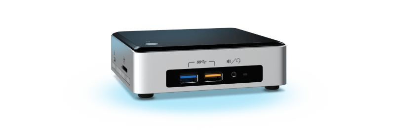
Intel® NUC
Intel®‘s NUC range come pre-built in a large variety of specifications or are also available in a ‘barebones’ option for you to upgrade as deemed necessary. The powerful hardware and small form factor make a great choice for almost any Digital Signage solution.
These are no means the only hardware options suitable for Interactive Signage. compatible devices can be found here.
Touch Gestures with embed signage
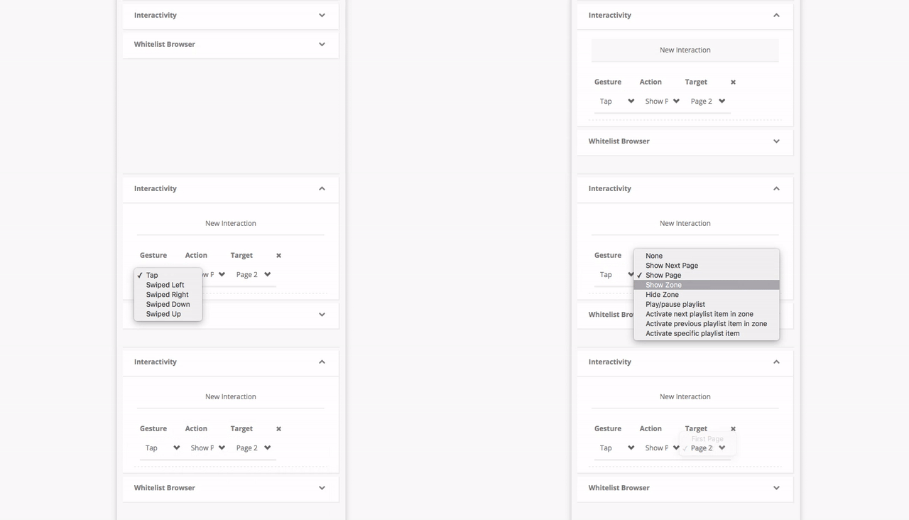
Creating a touch layout might sound like an ominous task but with it’s as simple as adding an interaction to a zone.
Users can build up pages with multiple zones and for any zone that needs to be interactable, simply add a touch interaction. Add Tap or Swipe functionality to an item with various outcomes, selecting from any of the following:
- Show next page
- Show page
- Show zone
- Hide Zone
- Play/Pause Playlist
- Activate Previous Item in Playlist
- Activate Next Item in Playlist
- Activate Specific Playlist Item
These numerous outcomes in conjunction with ‘s powerful ‘WYSIWYG’ layout builder gives users the flexibility to create complex touch layouts quickly and easily… and importantly without having to be a coding wizard!
The aim of this post was to inform you of the numerous elements that need to be taken into account when developing interactive experiences and the pitfalls to avoid. If you’ve made it this far, I hope you’ve found this post helpful or at least thought provoking.
Share your tips or tricks for creating interactive digital signage content by leaving a comment below.
Keep informed
Make the most out of your Digital Signage by signing up to our Insights and following us on social media.
There will be many more insights to come.
Not using digital signage yet?
If you’ve not using digital signage yet, give it a try. Sign up for a free embed signage account or get in touch with us here.
