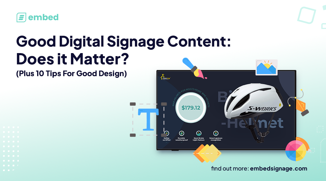
Good Digital Signage Content: Does it Matter? Plus 10 Tips For Good Design
? SPOILER ALERT ? Yes, good content really does matter!
Good Design is subjective, right?! Well, kind of… turns out there is some pretty compelling evidence to suggest that good design can be achieved by following specific rules. Not only that, but good design can influence the impact of a message and subsequently audience behaviour.
You can measure ‘good’ design against outcomes like audience recall, speed of information delivery and evocation of emotion, so design changes can be tested, refined and repeated to improve its impact.
In this article (proudly written by a Human for Humans), we will explore some core design principles which you can apply to your digital signage content designs today, to help elevate your digital signage communication.
First, we’ll start off by highlighting some of the common design mistakes we see on Digital Signage so you know what to try and avoid. Then once we know what not to do, we can dive into some practical tips to improve design and showcase some prime examples that demonstrate the genuine and significant impact good design can have for your digital signage.
Let’s begin…
Common Design Mistakes in Digital Signage
Let’s start by saying, it is easy to make these mistakes. Not everyone managing digital signage content is a designer nor have they had any training on what is considered good design. Essentially, you don’t know what you don’t know, so we hope by highlighting some common digital signage design mistakes that it’ll raise awareness on what to avoid and help users upskill to create more memorable and engaging digital signage experiences for their audiences.
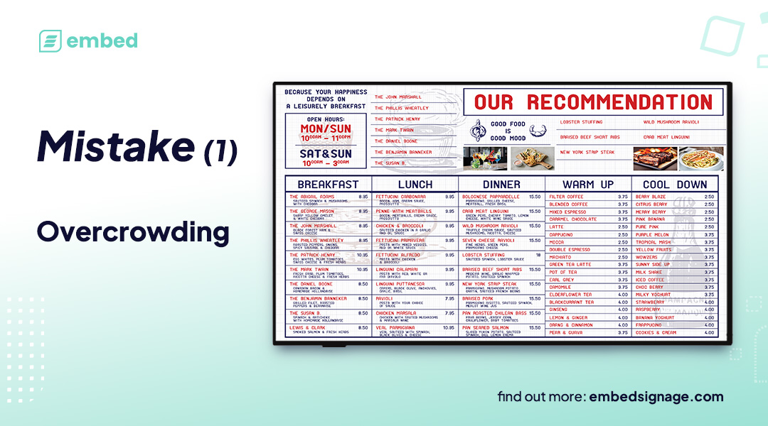
Mistake #1: Cluttered Screens
This has to be the absolute most common mistake witnessed in digital signage design. Treating Digital Signage like a traditional notice board and putting waaaayyyy too much content on the screen at once, overcrowding the screen with too many messages. Avoid overwhelming viewers with too much content and instead try to focus on delivering clear, concise messages with design that will capture their attention and get the message across – the beauty of digital is you can rotate content easily so there is no need to try and squeeze everything on the screen at the same time.
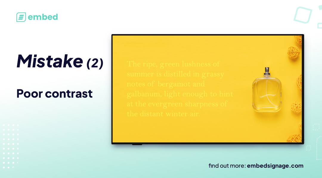
Mistake #2: Poor Contrast
Contrast is the difference between elements, not just colours. Contrast can apply to shapes, textures, directions and typography too. But the most common and obvious mistakes seen with contrast is that of colour. The difference between text and background colours not being sufficient leads to content being difficult to read and ultimately meaning the message is lost.
Mistake #3: Too many moving parts
Multiple videos running simultaneously, text scrolling up, scrolling RSS, social media feeds, lots of HTML animations… arrgh! Pure visual overload… your eyes simply do not know where to look and you end up not being able to process any of the information in a meaningful way, thus your audience ‘switch off’ and learn to ignore the screens! Not the outcome you’re aiming for I’m sure.
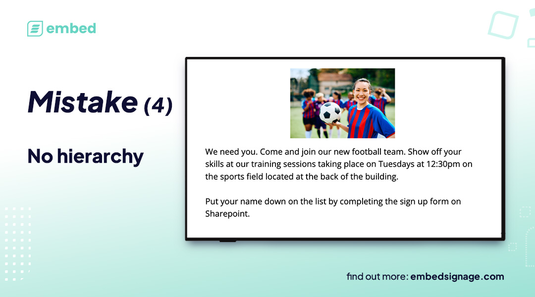
Mistake #4: No Hierarchy
Creating a clear visual hierarchy is crucial in guiding your viewer’s attention to your most important content. Use larger fonts or bold text to highlight headlines or important information. Employing the right screen layout can also establish a visual hierarchy, making it easier for viewers to navigate and digest your content.
Digital Signage Content Mistakes Recap
Ok, now we’ve touched on the common mistakes we see with digital signage content, let’s explore what you can do to elevate your digital signage design.
Our Top 10 Tips for Designing Good Digital Signage Content
Before embarking on content design, there are some key things to consider:
- Your digital signage screens are typically going to be viewed from a distance, so the content must be easy to read and understand… from a distance
- Carefully think about where your content will be viewed. Will it be a portrait screen, landscape, billboard, multi-screen video wall etc. Content should be adjusted to suit the intended end point.
- Who are the audience? Consider demographics and social environments, is the content broad or targeted?
- What is the impact you want from your signage? Is it for the audience to take a specific action, to digest and retain key information or to create ambience?
We’d recommend always using these four points as a critical part of your decision making process when designing your content.
With that in mind, here are some of our top design tips which you can start implementing today that can help get your message across.
Tip #1: Keep messaging focused
Try to keep focus on a single message at a time. Studies have proven that keeping a single key message has a better chance at landing with the audience. Attempting to convey too many messages simultaneously will likely result in none of them coming through to a strong extent.
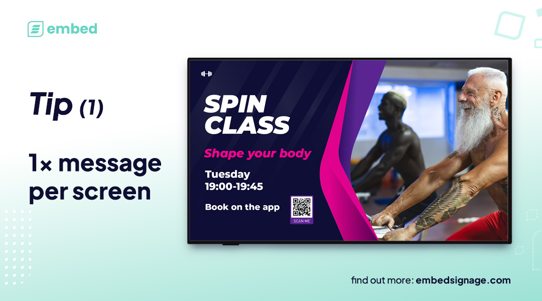
Good Digital Signage Content Design Tip #1:
Try to keep to one core message per screen to increase your chances of the message landing with your audience
Tip #2: Say it with images
According to research by MIT, the human brain can process entire images that the eye sees for as little as 13 milliseconds – speedy! This illustrates beautifully that the brain can make sense of even briefly presented images giving you an avenue to help deliver or emphasise your message through imagery.
But images can also be paired with text to emphasise and improve the message. In a study by W. Howard Levie & Richard Lentz, they found that people following directions with text and illustrations do 323% better than people following directions of text only.
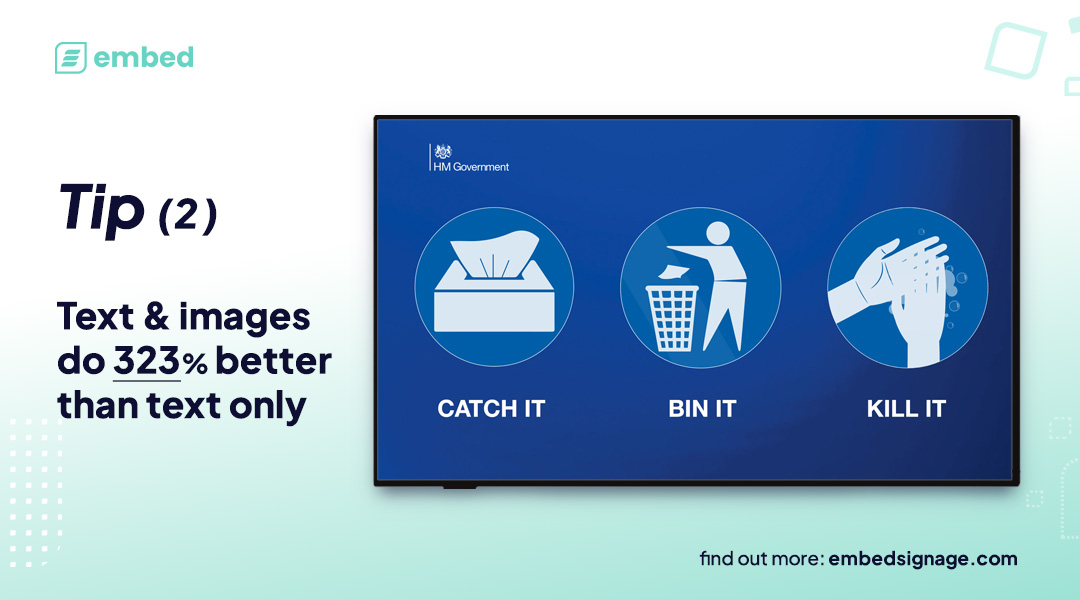
Good Digital Signage Content Design Tip #2:
Pair text with images to make it easier for the audience to process
Use of Fonts
Choosing the correct font can enhance a design, but selecting the wrong one can ruin it. But even once you have the right font, there are more things to consider about how to use text to get your message across.
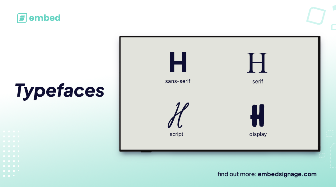
To start, it’s good to understand the variety of typefaces, then we’ll go into ways to use fonts in design to impact communication. There are many typefaces and below we’ve highlighted some of the most common ones:
- Serif – “Serif” refers to either the mark or line that can sometimes appear at the end of a character’s stroke, or the collective name for typefaces that use serifs in their design
- Sans Serif – A “Sans Serif”, or simply “sans”, is a typeface designed without serifs (from “sans”, the French word for “without”)
- Script – Script is a genre classification for typefaces that take direct influence from handwriting and calligraphy
- Display – “Display” means type intended for large sizes i.e. titles and headings
Tip #3: Improve Reading Speed with Sans Serif
Studies have shown that the absence of serifs in typefaces can increase the speed of reading which means if you have limited attention time for your screens, using Sans Serif fonts can assist getting your message across.
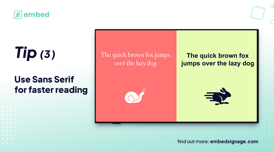
Good Digital Signage Content Design Tip #3:
Sans Serif fonts improve reading speed, so if your audience has limited screen time opt for Sans Serif fonts
Tip #4: Typography Hierarchy Increases Readability
When it comes to establishing a font hierarchy, size is typically the go-to element; bigger fonts usually mean higher placement in the hierarchy. Studies indicate that making a font bolder can enhance readability and draw the reader’s focus. Therefore, it’s more effective to use bold and larger text sparingly rather than completely changing the font throughout your design.
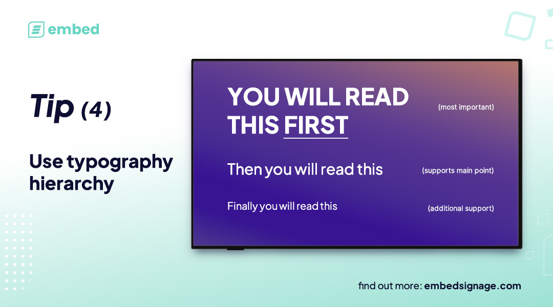
Good Digital Signage Content Design Tip #4:
Adopt typography hierarchy which shows your audience which information to focus on. Clearly showing what is most important and what is just supporting the main point.
Tip #5: Use Emphasis to Draw Attention
To capture the readers’ focus, a simple method is to highlight particular words, sentences, or paragraphs. The most popular technique is to make the text bold, which enlarges the letters and naturally draws attention. Other methods include changing colours, altering the size, using shapes to mark / highlight elements or using different fonts altogether. Using Italics, Underline, and Strikethrough can also be used but consider the impact of these on audiences with visual impairments (more on that below).

Good Digital Signage Content Design Tip #5:
Emphasise particular words or elements to direct the focus of your audience
Tip #6: Accessibility
Dyslexia is believed to affect between 9-12% of the world population and studies carried out in this area, have shown that font choice and styling impact the readability. Use Monospaced and Sans-serif typefaces to improve readability for those with Dyslexia. Good fonts for people with dyslexia are Helvetica, Courier, Arial, Verdana and CMU, taking into consideration both, reading performance and subjective preferences. Note that italic fonts decrease reading performance for those with Dyslexia,
When designing for individuals with visual impairments, it is important to prioritize good contrast, larger fonts, and clear spacing. It is best to steer clear of stylistic fonts that may be visually appealing but difficult to read for those with impaired vision. Instead, opt for bold or semi-bold styles and avoid using all caps, underlining, or italics, as these can make the text harder to decipher.
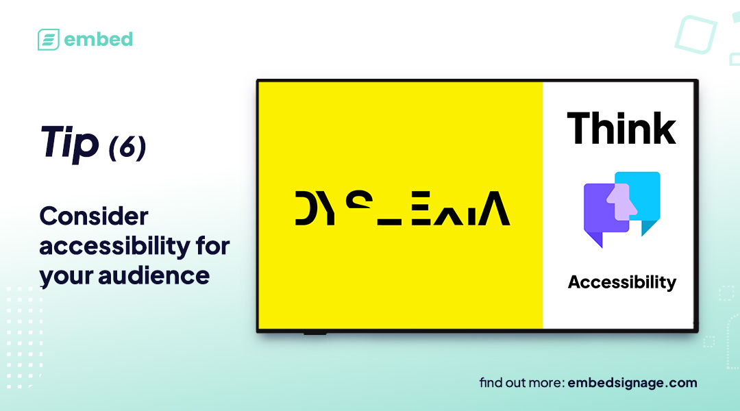
Good Digital Signage Content Design Tip #6:
Consider your audience’s ability to read and understand messages. Adjust your designs accordingly.
Use of Colour
Colour plays a really important role in evoking emotions and guiding the viewers attention. Keeping colours consistent throughout designs brings harmony and uniformity with messaging so it’s important to consider the use of colours.
There are various rules that can be followed but one of the best and most straightforward to understand is the 60-30-10 rule.
Tip #7: 60-30-10 Rule
The 60-30-10 originates from Interior Design but can be used and applied to digital signage. The rule is all about having a simple but effective way to create a balanced and cohesive color scheme for your designs.
As the name suggests, the rule is based on three main colors that will make up the colour scheme with a percentage split of 60, 30 and 10.
- 60% – the dominant / primary colour. This will cover the majority of your design such as the background or the main element
- 30% – the secondary colour. This colour complements the dominant and adds visual interest
- 10% – the accent colour. This is the one that brings a sprinkle of vibrancy and energy to the design – it’s applied to call to actions, highlight specific details or any elements you want to draw the viewers attention to
This rule gives you the core base to use for your designs. You can then use variations (tones, tints and shades) that complement these colours in certain elements to bring the message together.
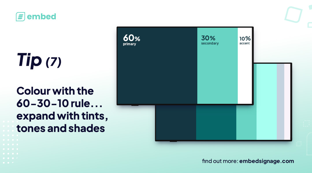
Good Digital Signage Content Design Tip #7:
Use the 60-30-10 rule to create a cohesive colour scheme for designs, then expand with variations of tones, tints and shades to complement.
Tip #8: Colour Associations and Emotion
Perception… it’s personal. However, there are some common traits with perception of colour that evokes an emotional response. In a 2020 study of 4,598 participants it was observed there are universal colour-emotion associations but preferences are modulated by factors such as age, gender, language and geography. So, there is certainly no ‘one size fits all’ approach but you can absolutely use colour psychology as a guide to give your messaging a boost in the right direction.
For some inspiration, take a look at Canva’s color meanings page which highlights a range of colours, their perceived emotional responses or associations and also helps you find additional colours to compliment it.
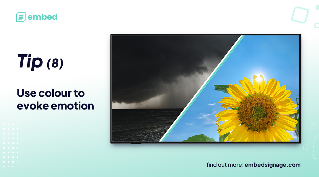
Good Digital Signage Content Design Tip #8:
Use colour psychology to evoke an emotional response from your audience and to enhance the message you are trying to deliver.
Tip #9: White Space
White space or ‘negative space’, is the empty space around or between elements such as images, shapes or text. German book designer, Jan Tschichold referred to this in the most appropriate way by saying “white space is to be regarded as an active element, not a passive background”.
Utilising white space effectively can help emphasise key information in a design and direct the viewer’s focus to critical elements. Intentional use of white space can establish a clear focal point in your design, so don’t be afraid to incorporate generous amounts of empty space in your layout.
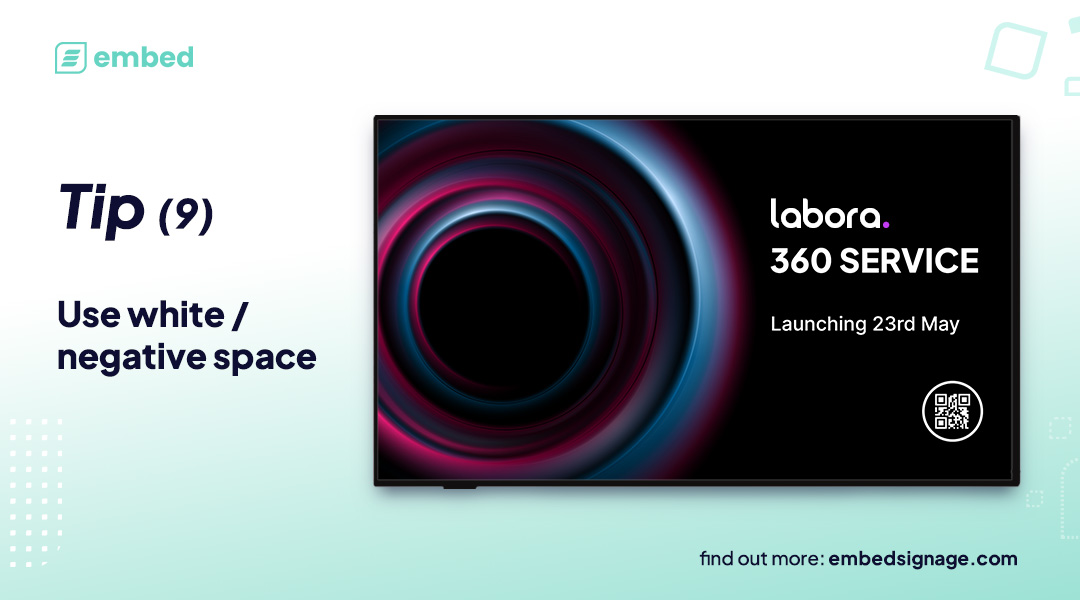
Good Digital Signage Content Design Tip #9:
Use white / negative space to establish a clear focal point in your designs and guide your audience to the critical elements.
Tip #10: Animation, Transition and Rotation
Digital signage provides an opportunity to use animations on elements, transition effects between items and rotation of on screen content.
These functions provide creative flexibility for you to experiment with but also to improve the success of your communication.
Rather than cramming everything onto one screen (which we’ve already established is a terrible idea), rotate messages to give each message ‘room to breathe’ and help the audience digest what is being presented.
Animations can bring messages to life using movement to catch the eye and increase audience attention. Animation effects like flares or shape morphs can be used to highlight specific elements and engage your audience, keeping them focused where you want.
Using transitions effects between content can assist in emphasising message changes. Fades, swipes etc can provide natural breaks between messages and visually let the audience digest the message is changing.
What’s The Real Impact of Good Design?
By following some of the guidance provided in this article, it’s possible to improve the impact of your digital signage content. Many brands have already witnessed a remarkable improvement in various aspects of their business simply by changing the design of their content shown on screen.
Workplace Communications
Writech, an Irish Fire Protection Systems company, use digital signage in their workplace for internal communications. They analysed the impact of their digital signage and put together a plan to improve their communication effectiveness through a series of design changes. These design changes focused on enabling their employees to digest content quickly, from a distance.
After these content design changes were implemented, Writech measured the results and they had an undeniable positive impact. Writech saw improvements across the board including improved message retention and employees positive perception of the screens.
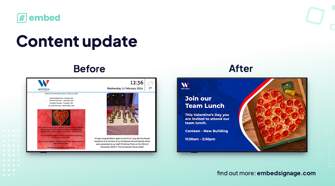
Writech Digital Signage Content Update:
Focused on the audience being able to digest content quickly, from a distance. The digital signage designs employ the brand core colour palette with imagery to reinforce text, typography hierarchy and focus on delivering one key message at a time.
QSR / Fast Casual Digital Menus
Burrito Loco, a mexican-inspired QSR, invested in new content design for their digital menu boards and monitored the impact. They witnessed a whopping 63% increase in sales fully attributed to their design changes.
Burrito Loco Digital Signage Content Update:
The new menu designs used accent colours to highlight key elements, employed a strong typography hierarchy and font selection plus used animation to draw focus to key messages, all helping drive sales.
Sports and leisure facilities
BPL, a not-for-profit social enterprise and charitable company, are a great example of using good digital signage design. They apply core design principles to all of their work and make use of content rotation, animation and transitions to drive focus to key messaging on screen. Not only that, they also ensure their designs are specifically tailored to the end screens, taking into consideration aspect ratios, visual distances, install environments and viewing distances.

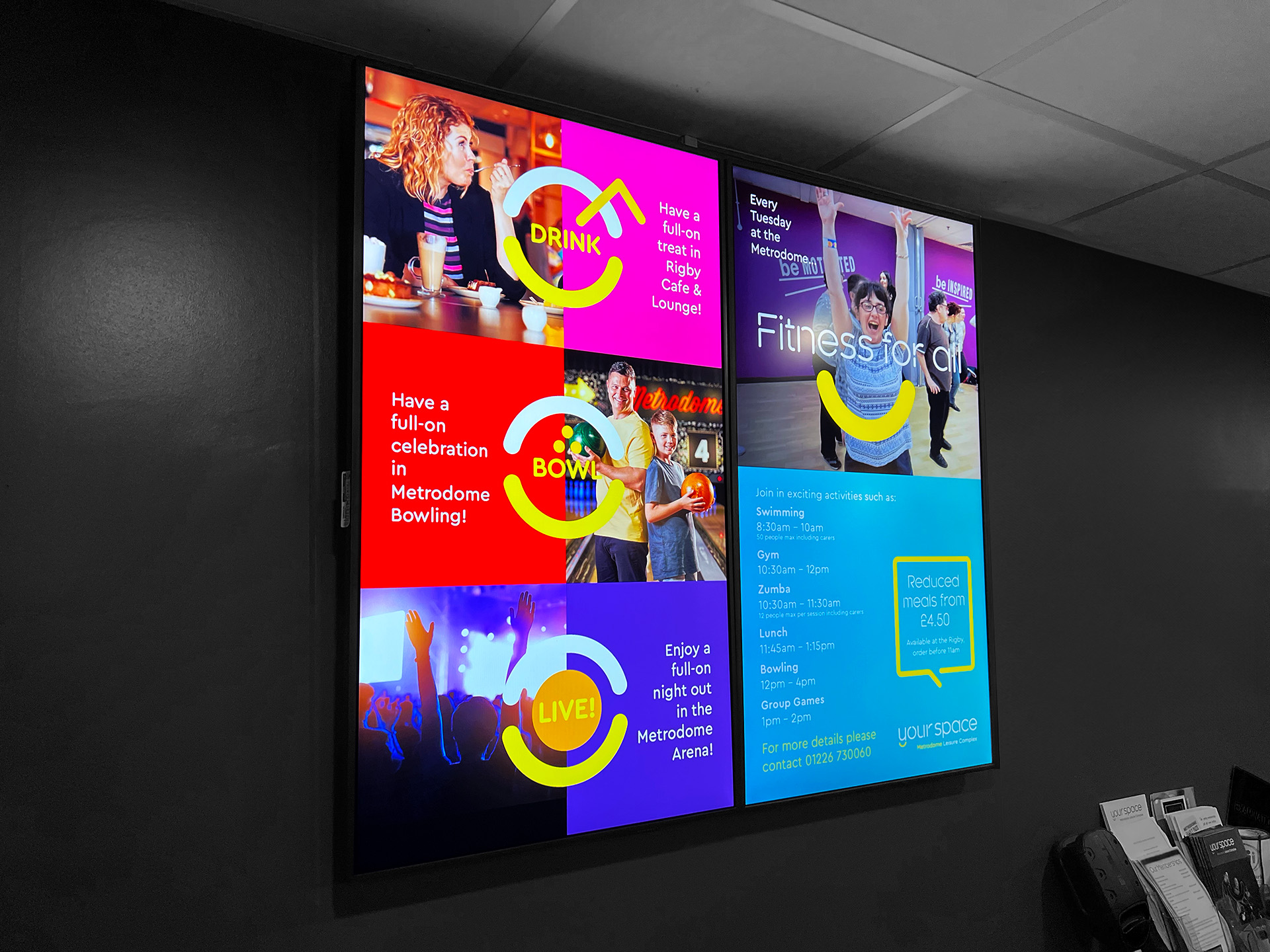
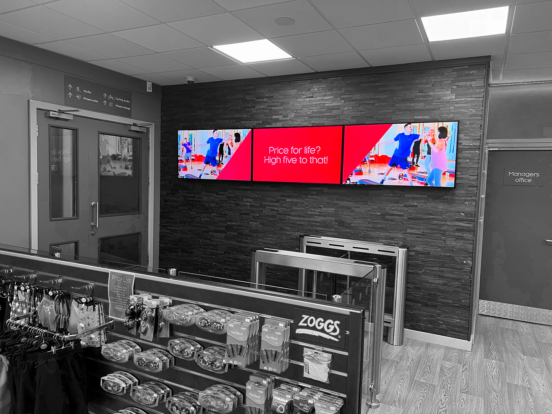
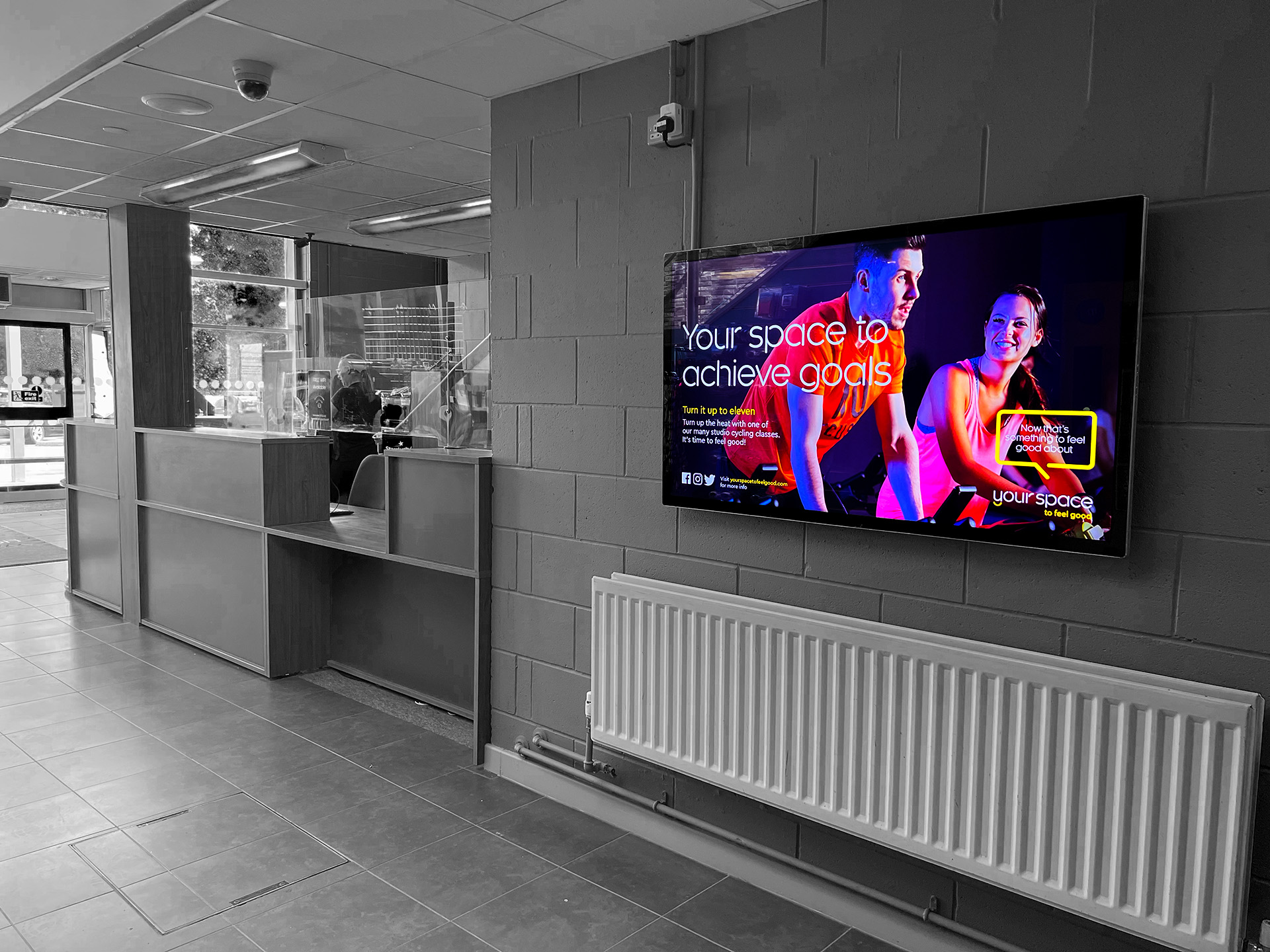
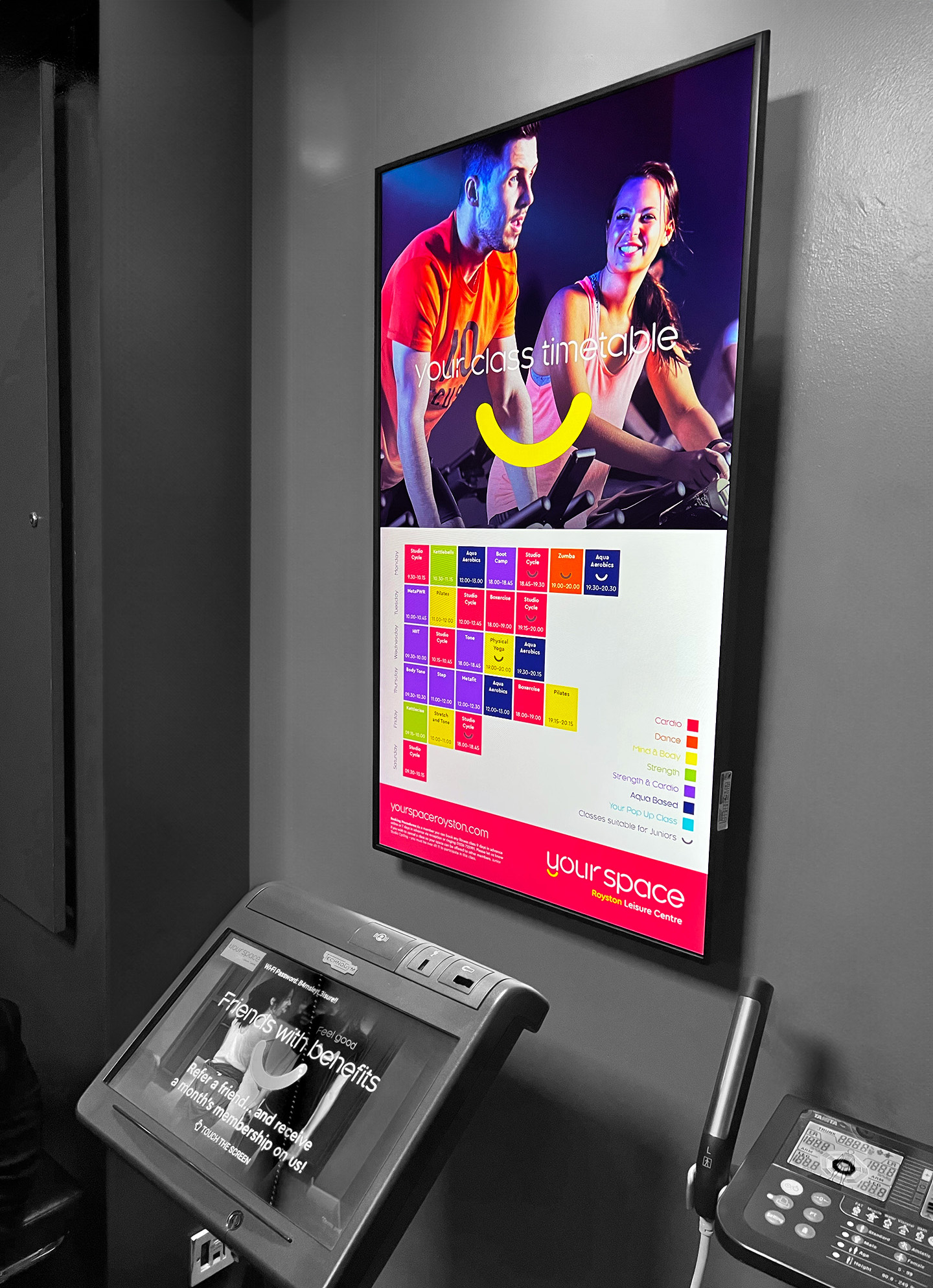
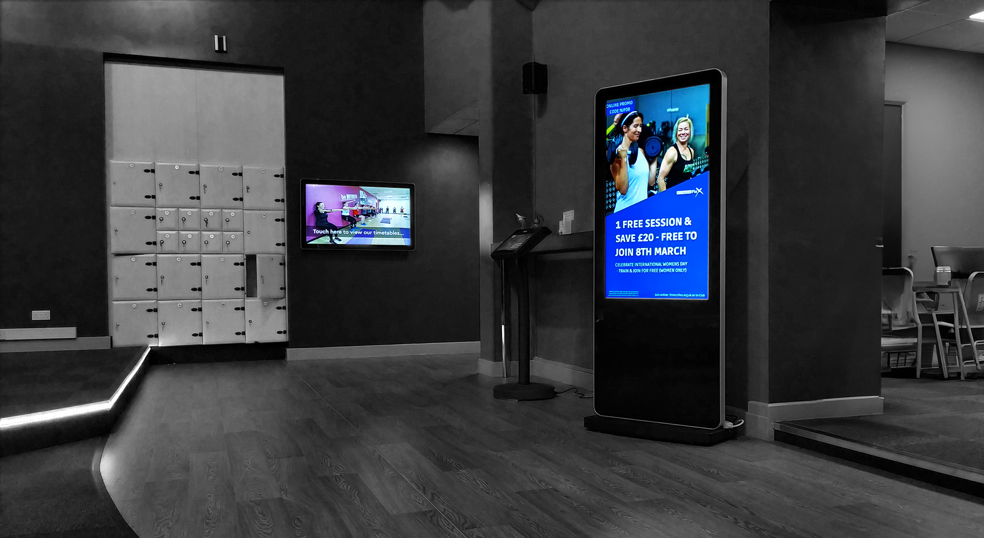
Good Digital Signage Content Design example: BPL
“we are able to communicate with our customers more efficiently than ever before”
James Lodge, Marketing Manager, Barnsley Premier Leisure
So, Does Good Digital Signage Content Design Really Matter?
We’ve provided just a few examples of where content has made a real impact on business outcomes and there are heaps of other businesses just like yours that are applying good design to improve the impact of their digital signage messages.
Ultimately, you could have the best screens and software in the world but if you put poorly designed, unthoughtful content on it, you’re passing up a MASSIVE opportunity to truly harness the power of digital signage as an impactful communication and influence tool. The choice is yours.
How can using embed signage help?
There are some excellent design tools and software available including Adobe Creative Cloud suite, PosterMyWall and Canva but bridging the gap between design and screen management is where comes in.
provides a range of tools for you to unleash your creativity and manage your network of screens from one place. From uploading your pre-made image and video assets or even custom HTML packages to building multi zone, multi page, pixel perfect screen layouts. With layering, drag and drop zoning, custom branding (fonts and colours), transition effects and much more in the layout builder, you can create some truly beautiful and impactful digital signage content. Then, with the built in device management features, you can distribute your content to your network of screens all over the world and check in remotely to see what content device(s) are displaying and if they’ve received the latest updates.
Want to give and try? Start your 28 day free trial below.